UI/UX — Interactive design

An interactive flyer system that connects through mobile app.
We designed an augmented reality experience that uses storytelling and interaction to raise awareness about everyday microplastic consumption. By scanning our custom-designed flyer with a mobile AR app, users unlock animated scenes and receive personalized insights into their plastic footprint.
Our process began with designing an engaging, foldable flyer to spark curiosity in physical spaces. We then developed a supporting mobile app that extends the flyer’s narrative into a more immersive and informative digital experience, ensuring both mediums connect seamlessly.
[My Role]
[Tools]
[Timeline]
[Problem statement]
How can we use design to turn a passive flyer into an active moment of reflection and self-discovery?
Most people are unaware of the microplastics they encounter in daily life — from food packaging to personal care products. Traditional awareness campaigns often fail to create lasting impact because the experience is passive and abstract.
-Most flyers are widely used in marketing but show low response rates (1–5%)
-Users often don’t pick up flyers voluntarily—they're usually handed out and discarded after a single glance.
The first step in the ideation phase was to define the target audience and develop user personas that would guide key design decisions for both the flyer and the app. Because this experience blends physical and digital elements, it was crucial to understand not only who would interact with the flyer, but also who would take the extra step to scan it and engage further through the app.


Flyer Design
The flyer was designed as the first touchpoint — a tactile, visual invitation to engage with the app. We explored multiple foldable formats to make it physically interactive and visually intriguing, encouraging users to open it, scan it, and learn more. Each panel of the flyer was designed to tease the story while guiding the user toward scanning specific areas with the AR app. The goal was to ensure that the flyer and app felt intentionally connected, both visually and narratively.
Interactive folds: Explored creative formats like accordion, gatefolds, and pop-ups.
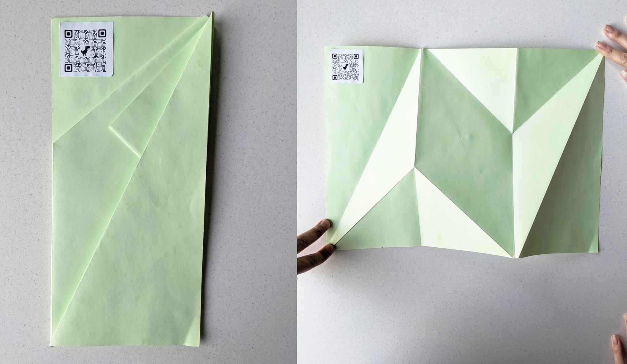
Planning how the story progresses and how the viewer's gaze travels across it.

We explored different ways to create a followable journey—one followed a path, the other mimicked a comic strip. The comic-inspired version won, as it not only guided the narrative effectively but also worked seamlessly with the flyer’s folds.


and voila!

Designing the App
After crafting a compelling physical flyer, we wanted to extend the experience into a dynamic, personalized digital space. The app wasn't just an AR scanner , it was designed to provide context, stats, animations, and allow users to rethink their plastic use through immersive storytelling.
Goal- Make the invisible problem of microplastics visible and personalized through lightweight interactions.

[Wireframing]
Once we had defined the user personas, app goals, and the overall interaction concept, we began designing the user journey. The focus was to keep the experience —simple, engaging, and informative. We began with low-fidelity wireframes to quickly sketch the structure, explore layout options, and map out how users would move through the app, from scanning the flyer to receiving personalized insights and tips.


Finalising the App
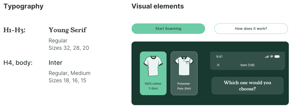
We chose a calm, eco-friendly color palette with soft greens and muted tones to reflect the theme of sustainability. A clean, minimal design system was created in Figma with reusable components like buttons, icons, and text styles to ensure visual consistency across the app.
[Brand Design]

[Illusturation]


